Table of contents
- Use Templates to make Reels Fast with Instagram Edits - Ep03
- Quick Comparison
- What Makes a Mobile Reel Template Worth Using
- 1. Product Carousel Reel Template
- 2. Day-in-the-Life Creator Reel Template
- 3. Bold Price Promo Reel Template
- 4. Before-and-After Transformation Reel Template
- 5. Text-First Tips Listicle Reel Template
- 6. Screen Recording Tutorial Reel Template
- 7. Trend Audio Lip-Sync Reel Template
- 8. Split-Screen Comparison Reel Template
- 9. UGC Talking-Head Testimonial Reel Template
- 10. Fast-Cut Unboxing Reel Template
- Template Comparison Table by Growth Goal
- How to Use These Reel Templates in a Content Plan
- Conclusion
- FAQs
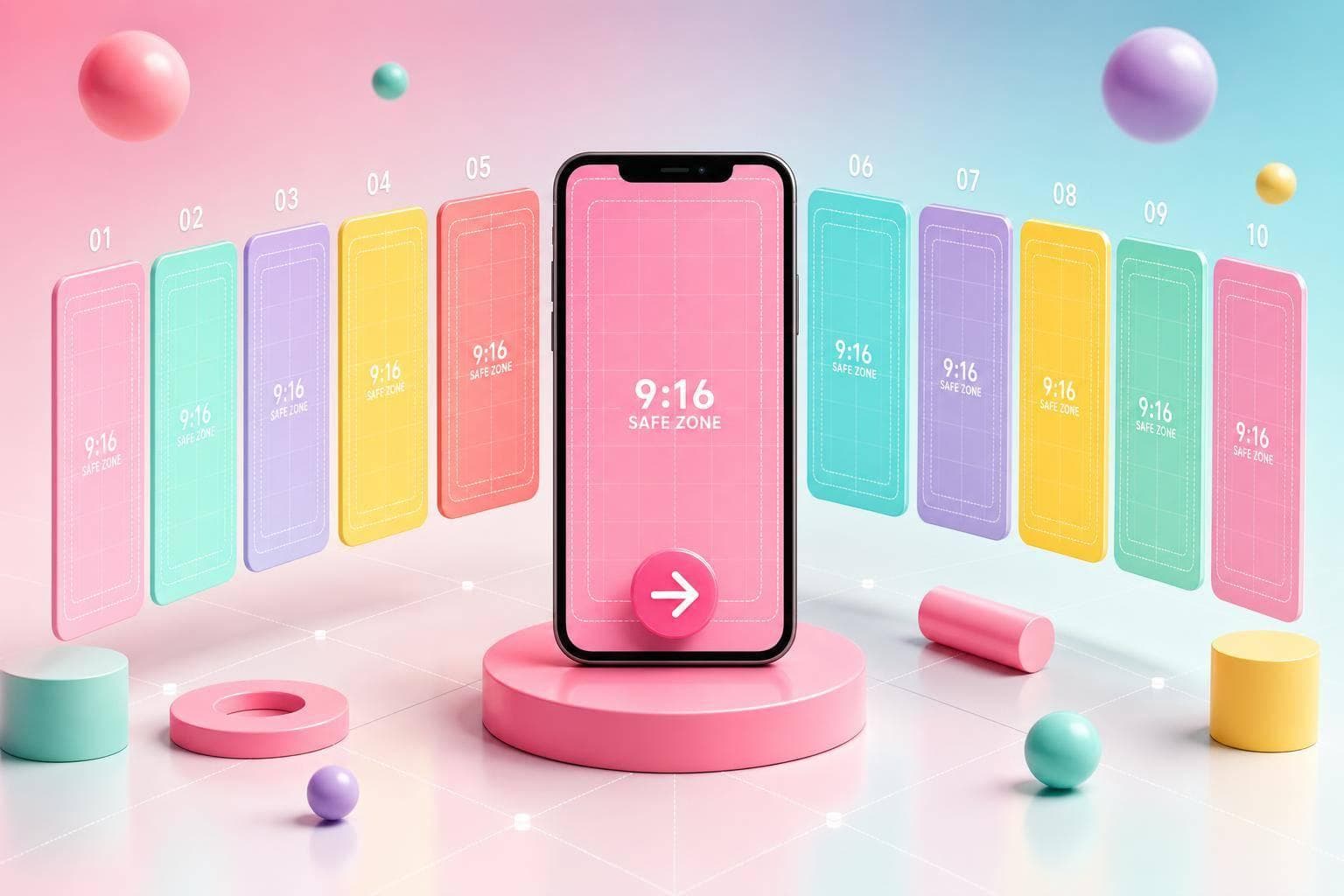
If I want more from mobile Reels, I don’t need more ideas. I need a few repeatable formats that fit the goal. This article breaks 10 Reel templates into plain use cases: reach, saves, profile visits, and sales. It also shows what to look for on mobile first: short edit time, safe text placement, a clear hook in the first 1–3 seconds, and one CTA on the last frame.
Here’s the short version:
- Product Carousel: best for showing multiple items in one Reel
- Day-in-the-Life: best for building familiarity with the person behind the brand
- Bold Price Promo: best for short sales pushes and discounts
- Before-and-After: best when the result is easy to see fast
- Text-First Tips Listicle: best for save-focused advice
- Screen Recording Tutorial: best for step-by-step phone demos
- Trend Audio Lip-Sync: best for reach and discovery
- Split-Screen Comparison: best for showing two options at once
- UGC Talking-Head Testimonial: best for proof from a customer or user
- Fast-Cut Unboxing: best for product reveals and first-look content
A few numbers stand out. Most high-scroll formats here stay in the 6–15 second range, hooks need to land in under 3 seconds, and text should stay inside the middle 60%–70% of a 1080 × 1920 frame so Instagram UI doesn’t cover it. The weekly Instagram marketing strategy in the article is also simple: 3–4 awareness Reels, 2–3 consideration Reels, and 1–2 conversion Reels.
Use Templates to make Reels Fast with Instagram Edits - Ep03
sbb-itb-3c55afb
Quick Comparison
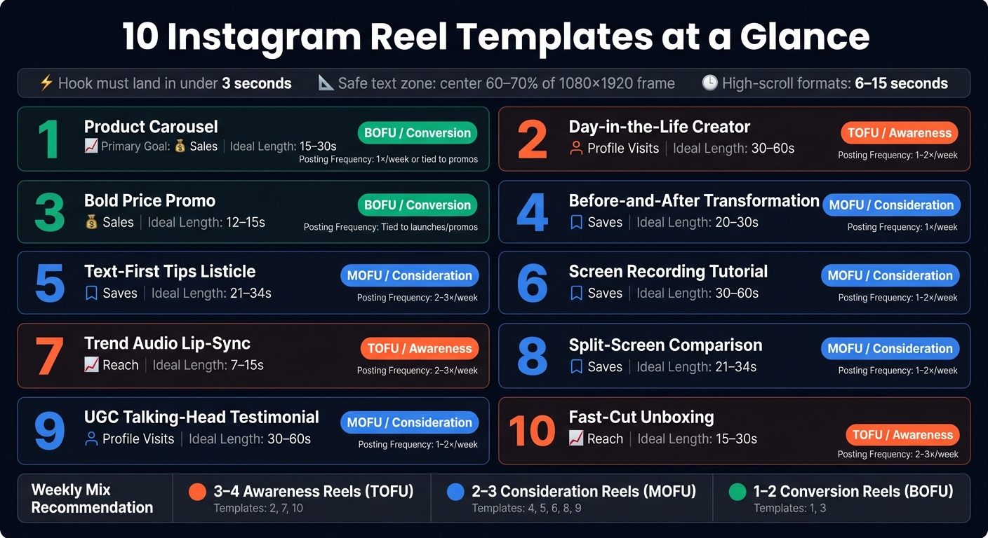
10 Instagram Reel Templates: Goals, Length & Funnel Stage
| Template | Main Goal | Best For | Ideal Length |
|---|---|---|---|
| Product Carousel | Sales | Multiple products, bundles, drops | 15–30s |
| Day-in-the-Life | Profile visits | Personal brand and behind-the-scenes | 30–60s |
| Bold Price Promo | Sales | Discounts, flash sales, price-led offers | 12–15s |
| Before-and-After | Saves | Visual proof and transformations | 20–30s |
| Text-First Tips Listicle | Saves | Fast educational tips | 21–34s |
| Screen Recording Tutorial | Saves | App demos and how-tos | 30–60s |
| Trend Audio Lip-Sync | Reach | Discovery and relatable reactions | 7–15s |
| Split-Screen Comparison | Saves | Side-by-side proof | 21–34s |
| UGC Talking-Head Testimonial | Profile visits | Social proof for warm viewers | 30–60s |
| Fast-Cut Unboxing | Reach | Product reveal and first impressions | 15–30s |
My main takeaway: I’d keep 3 to 5 templates, assign each one a job, and test hooks, length, and CTA wording instead of rebuilding every Reel from scratch.
What Makes a Mobile Reel Template Worth Using
Not every Reel template looks good once you open it on your phone and start editing. Some seem fine at first, then turn into a mess of tiny layers, awkward text placement, or slow exports. A simple way to judge them is to use four checks: edit speed, text safety, hook readability, and CTA space.
Fast Mobile Editing and Clip Swaps
Pick templates you can edit from start to finish on mobile. That means clear clip placeholders such as "Clip 1 – Product Close-Up" or "Clip 2 – In Use." When labels are this clear, you can swap footage in the right order without digging through layers or guessing what goes where.
The timeline should stay short, usually 6–15 seconds. That length works well for Reels and keeps editing from dragging on. It also helps if the template uses simple transitions like jump cuts or light zooms, since those tend to render faster on mobile. The goal is pretty plain: fast clip swaps, light text edits, and a quick export.
Safe Text Zones for Reels
Text placement can make or break a Reel. If your headline or price slips too low or too far right, the app interface can cover it up. That's why key text should sit near the center of the frame, away from the bottom bar and the right-side icons.
A solid template keeps all must-see text - headlines, prices, promo dates, and CTAs - inside the central 60–70% of the 1080 × 1920 frame. For promo Reels, stick with mm/dd/yyyy dates, like "Sale ends 08/31/2026", and simple price formats like $39 or $99.
Readable Copy and Strong Hook Frames
The first 1–3 seconds decide if someone keeps watching or scrolls past. So the hook has to read fast on a small screen. Short, high-contrast text usually works best, with phrases in the 3–7 word range.
For example:
- "Stop Wasting $ on Ads"
- "3 Hacks Dermatologists Swear By"
Use large, bold fonts so the message still works for sound-off viewing. A good template already locks in that structure, which means you only swap the words instead of rebuilding the whole layout.
CTA Space on the Final Frame
The final frame is the moment where people decide what to do next, making it one of the most effective ways to drive traffic from Instagram. If the CTA is cramped or hidden near the bottom UI, you lose that chance.
Use one clear CTA, like "Follow for daily tips", "Save this for later", or "Tap the link in bio." Put it on a clean last frame with enough room above the bottom interface so it stays easy to read.
Use these four checks to judge the templates below.
1. Product Carousel Reel Template
Best Use Case
Use this template when you need to show several products in a short amount of time: new collection drops, best-sellers, or bundle deals. It works well for beauty brands showing skincare items, boutiques featuring seasonal collections, or creators filming product hauls. Each card gives one item its own moment, so nothing feels jammed into a single frame.
Edit Flow
Keep it to 5–8 frames over 15–30 seconds. Start with a hook, then give each card one clear job: show one angle or one benefit. On slides where price matters, add a price callout. In the middle, mix in lifestyle shots so the Reel doesn’t feel like a flat catalog. End with a CTA card.
A few layout rules matter here:
- Keep text inside the central 60% of the 1080 × 1920 frame
- Use simple cut or swipe transitions
- Lock your fonts and colors so you only need to swap product names, prices, and clips
Hook Frame
Once the layout is in place, the hook needs to stop the scroll in the first 1–2 seconds. Go with something specific, like 3 Must-Have Desk Upgrades or 5 Under-$50 Gifts They'll Actually Use. Then pair that line with a bold product close-up or a fast zoom-in on your hero product.
If you want to add a price anchor, keep it small and place it in the upper safe zone. Format it like this: From $19.99
CTA Placement
Put the CTA on the final frame only. One clear line is enough, such as Tap the link in bio to shop or Save this Reel for later. Place it in the upper or center area of the last frame, above the bottom UI
Use this template when the goal is breadth; use the next one when the goal is personality.
2. Day-in-the-Life Creator Reel Template
Best Use Case
If the first template sells the product, this one sells the person behind it.
Use this template for personal brands, lifestyle creators, coaches, freelancers, and business owners who want trust instead of a hard sell. It works well for morning routines, shoot days, and what I do all day Reels that bring in follows and profile visits.
It also works nicely between product-focused posts. That keeps your feed feeling more personal and less sales-heavy. The format helps build trust, increase profile visits, and support follow growth by showing the creator or owner, not just the offer.
Edit Flow
Use 5–8 short clips in chronological order: waking up, planning, working, filming, and wrapping up.
Add on-screen labels for the hook, scene context, and closing line so the story is easy to scan on mobile. Keep the edit simple. Use clean cuts, add one light speed ramp if needed, and leave extra footage so you can tighten the story during editing.
Start with identity, move through the day, and end with a payoff or lesson. Film extra clips, trim them in a mobile app, add a scene label, and publish with a custom cover.
Hook Frame
Open with a clear, role-based hook that tells viewers who you are and why this day matters.
Use lines like A day in my life as a full-time creator, Come with me on a content shoot day, or How I structure my day to stay consistent. Pair that text with a strong visual, like a laptop setup, a coffee pour, or a quick action clip, so your identity is clear right away.
CTA Placement
Place the CTA on the final frame, after the routine has enough context.
A line like Follow for more behind-the-scenes content, Save this for your content ideas, or Comment "day" if you want the full routine works here because the viewer now understands what they just watched. This template is built to drive follows, saves, and profile visits, so the closing line should match that goal.
3. Bold Price Promo Reel Template
Best Use Case
Use this template when the goal moves from trust to sales. It works best when the price itself does the heavy lifting and makes people stop scrolling.
Think flash sales, short-term discounts, bundle offers, and under-$X deals. It’s a strong match for e-commerce brands in beauty, fashion, accessories, and consumer goods. It also works well for digital products with a clear price anchor, such as "Was $149, now $59 for 48 hours." Use it when you want fast clicks, taps, or purchases from warm viewers.
Edit Flow
Keep the Reel between 10 and 15 seconds.
A clean mobile edit usually works like this:
- Start with a bold price hook on a high-contrast background
- Add a second text slot with the original price and the promo price
- Move through 2–3 fast product clips with short benefit lines
- End on a CTA frame that repeats the offer
Save the project with placeholder text like [DISCOUNT] and [PRICE].
If viewers can’t grasp the price and value right away, trim the visuals and tighten the copy. The offer should land almost instantly.
Hook Frame
Put the price in the first frame, close to the upper center. Use a large, bold sans-serif font in a high-contrast color so it’s easy to read on a phone screen.
Keep both the price and the support line in the upper-middle area, away from the bottom UI. A headline like Premium Hoodies Under $40 or Today Only: 30% Off, plus one short support line underneath, is enough.
A quick zoom-in or pop animation on the price in the first half-second can help stop the scroll.
CTA Placement
Place the main CTA on the final frame, center-lower, above the app UI. Repeat the price or discount there so even late viewers still catch the offer.
Short CTAs like Shop Now, Grab Yours Today, or Tap to Claim tend to work well for warm audiences. Use one CTA only per Reel.
4. Before-and-After Transformation Reel Template
Best Use Case
Use this format when the result does the heavy lifting.
If someone can understand the win in 3 seconds or less, this template fits. The before/after contrast sells the point fast, without much setup. That makes it a strong repeatable proof format for building trust and driving saves, follows, and clicks using free Instagram tools.
Edit Flow
Keep the full Reel between 6 and 12 seconds. For a clean mobile edit, follow this sequence:
- Open with a 0.5–1 second after teaser.
- Cut to a 1–2 second before shot with the label in the upper third.
- Insert 1–3 short process clips.
- Return to a 2–3 second after hero shot with light motion.
- End on a 1–2 second end card with the CTA centered.
Keep all text labels - Before, After, timeframes like Day 1 vs. Day 30, and any step callouts - inside the middle 60–70% of the screen. That’s the safe zone where text is more likely to stay clear and easy to read on mobile.
For contrast, use combinations like white text on a dark semi-transparent box. If people are watching on mute - and many are - the label still needs to land at a glance.
Hook Frame
Start with the after shot. Then layer in the hook.
The goal is simple: show the result first, then add 3–7 words of curiosity-driven text in bold type. Short wins here. A few examples:
30 days of this = these results
The $20 fix that changed everything
The first works well for fitness or habit content. The second fits budget-friendly DIY or beauty transformations. Different niche, same idea: let the result stop the scroll, then use the text to pull people in.
CTA Placement
Put the CTA on the final after frame or on a separate 1–2 second end card. Make it large enough to read on a 5–6 inch screen, and give it contrast with a solid text box or drop shadow. Place it in the lower third.
A few solid options:
- For saves: Save this for your next room refresh.
- For follows: Follow for weekly before-and-afters.
- For DMs: Comment PLAN and I'll send the steps.
Stick to one CTA per Reel.
This template works best when the outcome is visual. If the point needs more explanation, move that text-heavy angle into the next format.
5. Text-First Tips Listicle Reel Template
Best Use Case
This format works best when each tip can stand on its own as a mobile card. Use it when the lesson fits into 3–5 short cards. Think 5 hooks that stop the scroll or 3 ways to style a white sneaker for summer.
Here, the content is the hook. Each tip gets one card, one point, and one fast cut. Coaches, consultants, educators, product brands, and local service providers use this well because it gives people something useful fast, even with the sound off.
Use this format to drive saves and profile visits.
Edit Flow
Keep the full Reel between 7 and 15 seconds for most tip lists. The flow is simple: hook frame → tip cards → CTA frame.
Give each tip about 1.5–2 seconds. You can stretch to 3 seconds if the text is heavier and needs more time to read.
Stick with one looping background and duplicate the same styled text layer for each tip. That keeps the pacing tight and the look clean.
Hook Frame
Start with one clear promise that states the payoff in under 2 seconds. Use a single bold headline in the upper-middle of the frame.
Examples:
5 IG mistakes killing your reachWant more saves? Try these 3 Reel ideas
These work because they’re specific and easy to grasp at a glance. Keep the background minimal and the text high-contrast so it reads fast on mobile.
CTA Placement
Finish with one last frame and one CTA. Match it to your current Instagram growth tips and goals.
Follow for more content tips.for follower growthComment GUIDE for the full checklist.for direct repliesDM PLAN for the full content calendar.for lead generation
Place the CTA in the center or upper-middle, above the UI.
Use this format when the message itself is the value. Use the next template when the value needs to be shown step by step.
6. Screen Recording Tutorial Reel Template
When the point is to show taps, swipes, or setting changes, skip tip cards and use a screen recording instead.
Best Use Case
This template is made for showing a phone-screen process step by step. It works best when the tutorial can be explained in 2–4 clear steps that people can copy on the spot. Good fits include app walkthroughs, product demos, and quick fixes.
It tends to earn saves because people can replay the steps. It can also drive shares when the tutorial fixes a common annoyance. In short, it turns a process into a step-by-step Reel people want to keep. Best for saves, shares, and authority.
Edit Flow
Keep the full Reel between 20 and 40 seconds for better completion rates. The flow is simple: hook frame → Step 1 → Step 2 → Step 3 → optional recap → CTA frame.
Give each step 2–3 seconds. Use a zoomed-in screen recording and a short text label like Open Settings or Tap Display & Brightness. Keep the same visual treatment on each step, such as a highlight circle, arrow, or tap indicator, so the pace feels even. Before you record, turn on Do Not Disturb and close any apps you don't need.
Hook Frame
The hook has to work a little harder here because screen recordings can look dull in the feed. Use 1–2 lines of large, bold text and lead with the result. For example:
Turn Any Photo Into a PDF in 15 SecondsStop Spam Calls With This iPhone Setting3 Taps to Fix Blurry Photos
Place the hook text in the upper third, away from the Instagram UI. Use high-contrast text over a dark overlay so people can read it fast, even with the sound off.
CTA Placement
End with a clean final frame and use one CTA in the center or upper-middle. Match it to your goal:
Save this so you don't forget.for savesFollow for more app tutorials.for follower growthComment guide if you want a longer walkthrough.for direct replies
Keep the CTA text above the bottom UI.
Use this format when clarity matters more than polish.
7. Trend Audio Lip-Sync Reel Template
Use this format when you want reach more than explanation. Trending audio helps a Reel feel native to Reels, and that can expand reach fast.
Best Use Case
Use this template when your main goal is reach and discovery. It fits creators, personal brands, and product-led accounts that want to get in front of new viewers by riding trending audio. It can drive profile visits and follows, and it may also lead to shares or saves when the situation feels very relatable. If reach is the goal, keep the edit short and let the audio carry most of the message.
Edit Flow
Keep it under 15 seconds. Shorter lip-sync Reels average around 72% completion, so a tighter cut gives more viewers a better shot of reaching the end. A simple structure works best: hook frame → lip-sync performance → optional mid-Reel text overlay → CTA frame.
Shoot in 9:16 vertical with your face centered and well lit. Use Instagram’s native captions so people watching on mute can still follow along. Add light in-app color correction, and match your performance to the audio’s most recognizable line.
The first visual needs to match the sound right away.
Hook Frame
Start with a close-up reaction shot and a 3–7 word line that fits the audio. Lines like POV: You run a small business or When your content finally gets views make the Reel feel relevant before the audio’s key line hits.
CTA Placement
End with one CTA in the final 1–2 seconds. A follow-based or profile-visit-based prompt works best here, such as Follow for more creator POVs or Comment if you relate.
8. Split-Screen Comparison Reel Template
Use this format when people need to spot the difference right away. The side-by-side visual does most of the work for you.
Best Use Case
Use this when a result makes more sense side by side, not one after the other. It's a good fit when viewers need to compare two versions at the same time, like product feature demos, old way vs. new way breakdowns, or side-by-side results.
This is different from a before-and-after Reel. That format leans on the reveal. This one is built for instant comparison.
Fitness coaches, home organizers, e-commerce brands, and social media agencies can all get good use from it, especially as mid-funnel proof content for people who already know you but still need a reason to follow, save, or click.
Keep the comparison centered on 3–5 points your audience cares about most, such as:
- speed
- cost
- ease of use
It works best when the viewer needs to pick between two options, not just watch one thing change over time.
Edit Flow
Plan both sides before you start editing. Set sync points so both panels hit the same beat at the same time, like both products starting together or both results showing up on the same frame.
Pick the hero panel early. If one side matters more, make it brighter or a bit larger so the eye goes there first.
Keep the Reel between 10 and 20 seconds. Add bold, short labels on each side, like "Before", "After", "Without," or "With." Then layer in tight callouts for the main differences, such as "2x faster" or "No residue."
To keep the edit from feeling stale, add a full-frame shot at the end instead of staying split-screen the whole time.
Hook Frame
Start with the strongest contrast in the first 1–3 seconds. That could be a messy before beside a clean after, or a side-by-side timer where one side clearly wins.
You can also place a question over the split, like "Which one would you choose?" That pulls viewers in and gets them to compare on purpose instead of passively watching.
Keep hook text:
- under 7 words
- high-contrast
- centered or placed in the upper-middle so Instagram's UI doesn't cover it
CTA Placement
End on a final frame that does one of two things. You can zoom into the stronger side full-screen and add a short CTA like "Try it this week" or "Shop the better fit." Or you can keep both panels on screen and place a short CTA over them, like "Comment A or B" or "Save for later."
Keep the CTA under 5 words. Place it in the center or upper-middle of the frame, never at the bottom where Instagram's caption and action buttons sit.
9. UGC Talking-Head Testimonial Reel Template
This format uses a real person speaking straight to camera about their experience with a product or service. It feels personal, even when the edit is tightly planned. Use it when demo content has already done its job and people now need proof before they buy.
Best Use Case
For warm audiences, this is the proof template. Use it when viewers are interested but still need that final push. It works well for DTC brands, coaching, beauty, fitness, and app-based offers, especially after a launch or promo.
In a content plan, this sits in the mid-funnel stage. The right target audience includes people who already watched your tips Reels, visited your profile, or engaged with earlier posts. At that point, a testimonial from a real user with a clear result can help move undecided buyers closer to action.
Edit Flow
When the audience is already warm, keep the structure simple. Aim for a Reel that runs 15–30 seconds, with the first 3 seconds doing the heavy lifting for retention. Start with the result, briefly show the before state, and finish with one CTA.
You also want movement on screen every 2–3 seconds. That could be a text pop, a cut to a screenshot or metric, or a slight zoom. The goal is simple: keep attention from slipping.
Build the template so a creator can plug in 1–3 talking-head clips, update 3–5 text overlays in fixed spots, and swap in one proof asset like a screenshot, metric, or review snippet. The layout should include:
- a bold hook line
- a lower-third name-and-result label
- a final CTA frame
Keep the edit light enough to finish on mobile.
Hook Frame
Use a tight face shot and a bold benefit line people can read at a glance. Outcome-first hooks like From 200 to 5,000 followers in 60 days work well. So do skepticism-based openers like I thought this was a scam. Both create instant curiosity.
Keep hook text to 10 words or fewer. Place it in the upper-middle of the frame. And make sure the speaker’s eyes are visible and expressive from the very first frame.
CTA Placement
Use a spoken follow prompt that matches the result, paired with on-screen text on the last frame. For example: Tap Follow for more real results plus the brand handle.
Place CTA text in the center or upper-middle of the frame, not near the bottom where Instagram’s caption and action buttons can cover it. End with one static frame so the layout is easy to reuse.
10. Fast-Cut Unboxing Reel Template
Fast cuts make the reveal feel worth watching. That idea sits at the center of this format.
Best Use Case
Use this template when the reveal itself is the hook. It works best for products where the box, layers, and first look add to the appeal, like consumer tech, beauty, skincare, DTC, and collectibles.
It also fits both discovery and warm-audience trust. That makes it a strong pick for launches, product pages, and save-worthy feed content. For commerce accounts, rotating 1–3 unboxing Reels per week alongside tutorials and testimonials keeps the mix from feeling stale without leaning too hard on one format. Use it when you want the product to feel instantly desirable.
Edit Flow
Keep the total runtime under 30 seconds.
A simple mobile edit flow looks like this:
- Hook in seconds 1–2
- Packaging reveals in seconds 2–6
- Close-ups through second 12
- Hero shots from seconds 12–20
- Optional first-use footage in seconds 20–25
- Static CTA frame at the end
Each clip should run 0.5–1 second to keep the pace snappy. Keep every clip vertical.
Use Instagram's native editor to trim, split, and reorder clips right on your phone. Add mid-Reel text in the upper third so it stays clear of the caption bar and the right-side buttons. Those overlays can point out key components and mention pricing in USD, like Bundle value: $249, price: $179.
Hook Frame
Start mid-action. Open with hands already cutting tape, a box moving toward the lens, or a product that's only partly visible. Skip logo cards and slow intros.
Add bold, high-contrast text in the upper-middle of the frame within the first 2 seconds, such as Is this worth $199? or Unboxing the most hyped gadget of 2026. Keep the copy short so people can read it fast on a small screen.
CTA Placement
End with a slower hero shot in the final 3–5 seconds. Place CTA text in the center or upper-middle of the frame, not near the bottom, where Instagram's username, caption, and audio details sit.
Short, direct CTAs tend to work best, like Follow for more unboxings or Save this before you buy.
Template Comparison Table by Growth Goal
Use this table in a simple way: pick the Reel format based on the template breakdown above, then use this chart to decide how often to post it and where it fits in your funnel.
| # | Template | Primary Goal | Content Category | Ideal Length | Frequency | Funnel Stage |
|---|---|---|---|---|---|---|
| 1 | Product Carousel | Sales | Product promotion | 15–30s | 1×/week or tied to launches or promos | Conversion (BOFU) |
| 2 | Day-in-the-Life Creator | Profile visits | Storytelling | 30–60s | 1–2×/week | Awareness (TOFU) |
| 3 | Bold Price Promo | Sales | Product promotion | 12–15s | Tied to launches or promos | Conversion (BOFU) |
| 4 | Before-and-After Transformation | Saves | Social proof | 20–30s | 1×/week | Consideration (MOFU) |
| 5 | Text-First Tips Listicle | Saves | Education | 21–34s | 2–3×/week | Consideration (MOFU) |
| 6 | Screen Recording Tutorial | Saves | Education | 30–60s | 1–2×/week | Consideration (MOFU) |
| 7 | Trend Audio Lip-Sync | Reach | Entertainment | 7–15s | 2–3×/week | Awareness (TOFU) |
| 8 | Split-Screen Comparison | Saves | Education | 21–34s | 1–2×/week | Consideration (MOFU) |
| 9 | UGC Talking-Head Testimonial | Profile visits | Social proof | 30–60s | 1–2×/week | Consideration (MOFU) |
| 10 | Fast-Cut Unboxing | Reach | Product promotion | 15–30s | 2–3×/week | Awareness (TOFU) |
The pattern here is pretty straightforward: match video length and posting cadence to funnel stage.
Awareness templates usually post more often because they’re built for reach at the top of the funnel. Consideration templates tend to run a bit longer and push for saves and profile visits. Conversion templates work best when they line up with launches, promos, and sales windows.
After you map each template to a goal, build your weekly content mix around it:
- 3–4 awareness Reels
- 2–3 consideration Reels
- 1–2 conversion Reels
Then track what happens. Use UpGrow's live analytics dashboard to monitor reach, profile visits, saves, and follower growth by template. From there, shift more of your posting toward the formats that are doing the most work.
How to Use These Reel Templates in a Content Plan
Now that you’ve picked the right template, the next step is simple: turn it into a weekly rotation.
Build a Weekly Mix of Template Types
A weekly mix helps you balance reach, trust, education, and conversion. Instead of posting the same kind of Reel again and again, rotate awareness, education, trust, and conversion across the week.
In most cases, you’ll want more awareness and education posts, with fewer trust and conversion Reels. That mix gives you room to bring new people in, teach them something useful, and then guide them toward action without making every post feel like a pitch.
Test Hooks, Length, and CTA Wording
Once your weekly mix is in place, test one variable per Reel. Change one thing, compare the results, then repeat what works.
To test hooks, keep the format the same and change only the opener. For example, you might swap a problem-led hook like "Stop wasting money on skincare that doesn't work" for a curiosity-led version. After 3–7 days, check Instagram Insights and look at:
- Watch time
- Completion rate
- Saves
- Profile visits
That gives you a clean way to see which opener kept people watching longer.
You can use the same approach for length. Shorter cuts tend to work better for promos and reach, while longer cuts usually fit tutorials and explanation-heavy Reels better.
CTA wording matters too. Rotate it based on your goal: follow, save, share, shop, or comment.
Reuse the Templates That Earn Saves and Profile Visits
After testing, keep the formats that bring in the strongest saves and profile visits. Check your Reels insights at least once a week in Professional Dashboard insights.
Pay close attention to reach, plays, saves, shares, profile visits, completion rate, follows, and watch time. If a template keeps scoring well on both saves and profile visits, that’s one of your best formats. Use it again 3–6 times a month, but switch in new products, topics, or clips while keeping the same core structure.
UpGrow's live analytics dashboard can help you compare which template types drive follower growth, profile visits, and engagement.
Conclusion
The best mobile Reel templates save time and make each Reel better. They lock in the hook, safe text zones, and the final CTA. That kind of repeatable setup also helps you post more often and get more reach with less guesswork.
From there, keep your stack small. Pick 3 to 5 templates that fit your niche, and give each one a clear role. When your formats stay consistent, filming gets faster and your social media workflow feels a lot less messy.
Then put those templates to work for two weeks. Start with 3 templates, map out your next two weeks around them, and keep the one that brings in the most saves and profile visits. Tracking these essential Instagram metrics will show you exactly what's working.
UpGrow can help scale that system with AI targeting and real-time analytics.
FAQs
Which Reel templates should I start with first?
Start with templates that fit your Instagram goal.
For educational posts, lean on problem-solution or step-by-step templates. They make it easier to teach one idea at a time without losing people along the way.
For product demos, use fast-fix or diagnostic hooks. They get to the point fast, which matters on a platform where people scroll in a split second.
If growth is the goal, put most of your effort into short 7-to-15-second videos with a clear flow:
- a 3-second hook
- a value-driven body
- a final call to action
Use your Professional Dashboard to find trending audio and templates. That gives you a better sense of what’s getting traction right now.
UpGrow can also help sharpen your plan with AI-powered targeting and real-time analytics.
How do I choose the right Reel length for my goal?
Start with your goal, then match it to the template. For general growth and high completion rates, 21–34 seconds is often the sweet spot.
Use 7–15 seconds for quick awareness or promos. If you're making tutorials, telling a story, or showing a deeper product demo, you can stretch to 60 or 90 seconds if engagement holds up. If completion drops below 40%, trim the edit and test again.
What should I test first: hooks, CTAs, or format?
Test hooks first. Instagram makes that call fast in the first 1–3 seconds, so create 3 to 6 hook versions while keeping the format, topic, and audience the same.
Then watch early performance over the first 24–72 hours. Focus on metrics like 3-second hold and watch time.
Once you find the hook that wins, move to proof/value. After that, test the CTA wording in the final 3–5 seconds.
The key is simple: change one element at a time so your results stay clean.